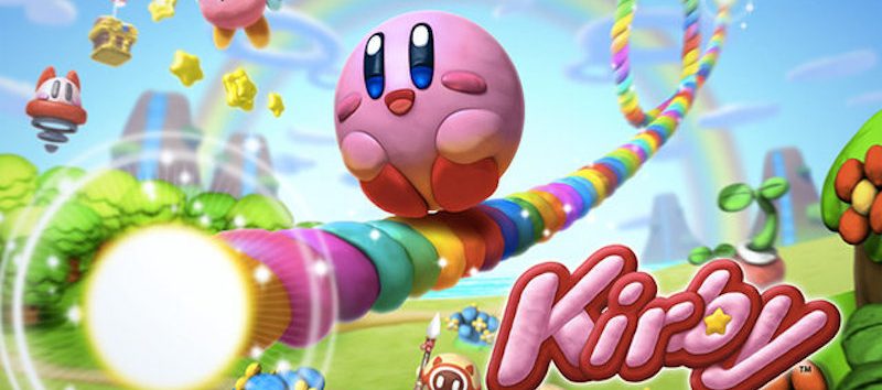
During my time as a gamer I’ve been an avid Nintendo gamer. Almost all of the video games ‘Big N’ releases are of stellar quality and deliver an experience like no other. Also Nintendo’s second party companies like HAL Laboratory manage to create games of high quality. HAL’s biggest franchise is of course the Kirby-one. This article will feature two of the games from that particular franchise. One which is pretty good and the other which is pretty bad, while both games are more or less execute the same concept on a different platform. Wanna find out what I am talking about?
Kirby: cursed games
I’m talking about Kirby’s Canvas Curse (Power Paintbrush in Europe), released in 2005 for the Nintendo DS. And it’s big brother Kirby and the Rainbow Curse (Rainbow Paintbrush in Europe) released ten years later for the ill-fated Wii U. I’ve always been in love with the video games starring the pink puffball. A little more than ten years ago I picked up the first Nintendo DS game starring Kirby: Canvas Curse. The quality of Kirby games is always very high although these games are often deemed to be a bit on the ‘easy’ side. However, Canvas Curse did exactly the opposite being quite difficult at some point. But this isn’t the only thing I dislike about this entry in the franchise.
Hard and imprecise
The controls of Canvas Curse are very hard to get used to and pretty imprecise to say the least. Also the touch screen on the regular Nintendo DS is way to small to make this sort of gameplay work and you are constantly getting in the way of yourself because of the stylus you control Kirby with on the bottom screen. However, my other points of criticism are the esthetics of the game world itself and the usage of the second screen.
Ugly mess
The gaming world of Canvas Curse looks so ugly compared to other Kirby games. To the point that you’re asking yourself if this is a Kirby game to begin with. The atmosphere is not detailed at all and looks kinda dark and dystopian to me. The second screen doesn’t look much better by showing some statistics and the ugliest mini-map in video game history. That’s why Rainbow Curse felt like a fresh breath of air.
Second Chance
Picking up and playing Kirby and the Rainbow Curse for the Nintendo Wii U last week meant I would give this subfranchise a second chance. It was the best choice I made in awhile. Where Canvas Curse esthetics look standard, Rainbow Curse blows the player away with gorgeous clay art and so much detail. Kirby and the Rainbow Curse really takes you on a journey where Canvas Curse pulls you through horrific looking levels that all look alike. The game might be a lot easier than its Nintendo DS predecessor. This might be so because of the much larger tablet your drawing on while playing the game. It makes Kirby a lot easier to maneuver through the levels.
Happy ending
So at the end of this journey I am very happy I’ve picked up Rainbow Curse. The game that scared me mostly of because of its predecessor. There is a special place in hell for bad and ugly games like Canvas Curse. Hopefully there will be a day that this quirky title gets a remake or remaster that makes it look a lot more like it’s beautiful big brother. Which is a piece of art that will probably makes it way to Nintendo Switch, because most Wii U game will anyway. Let’s hope so!
Click here for more articles about video games!

1 Comment